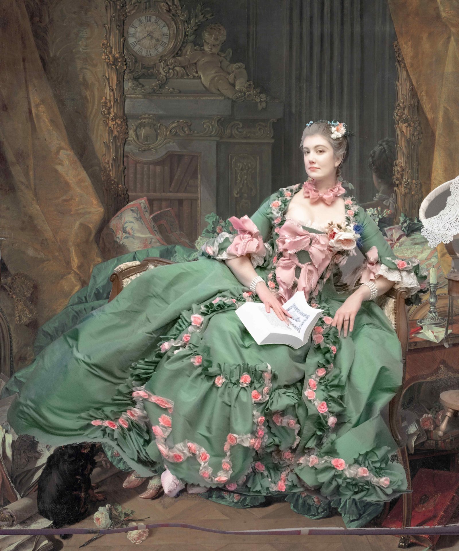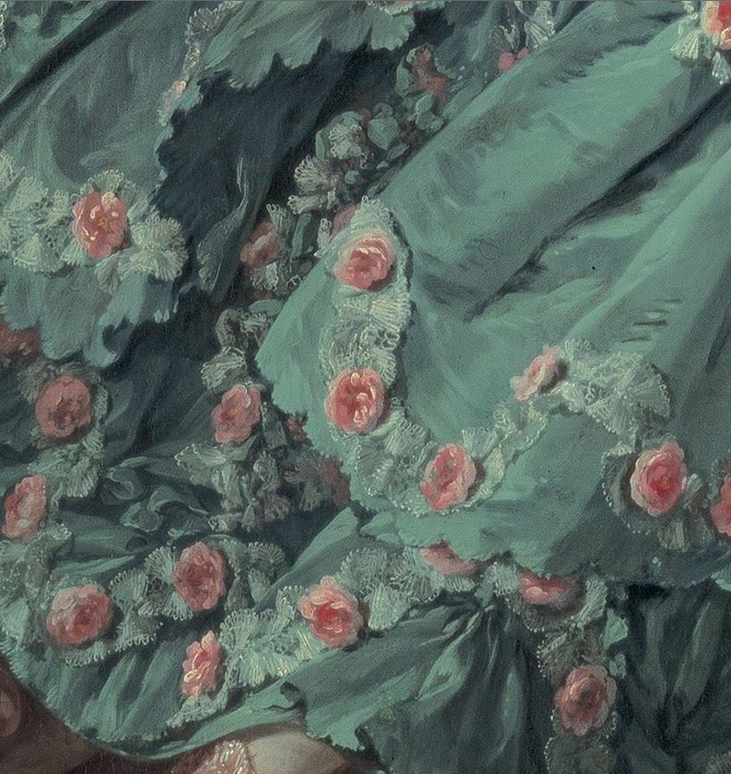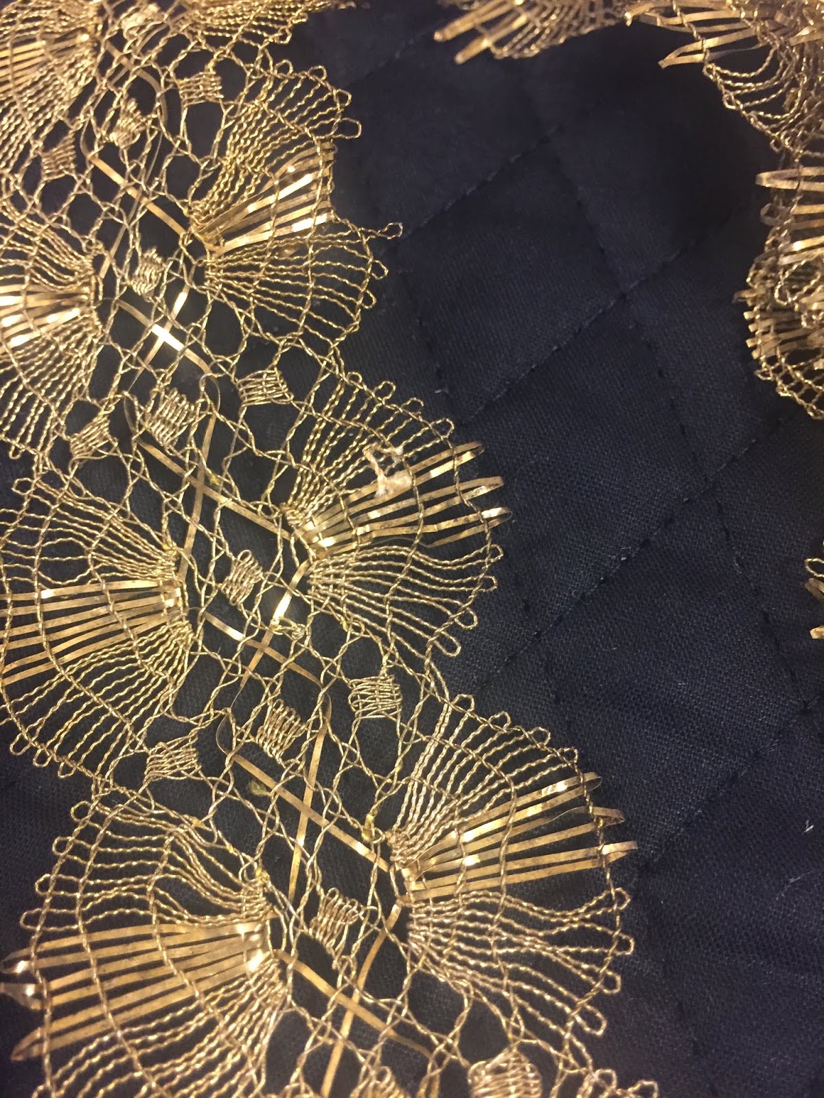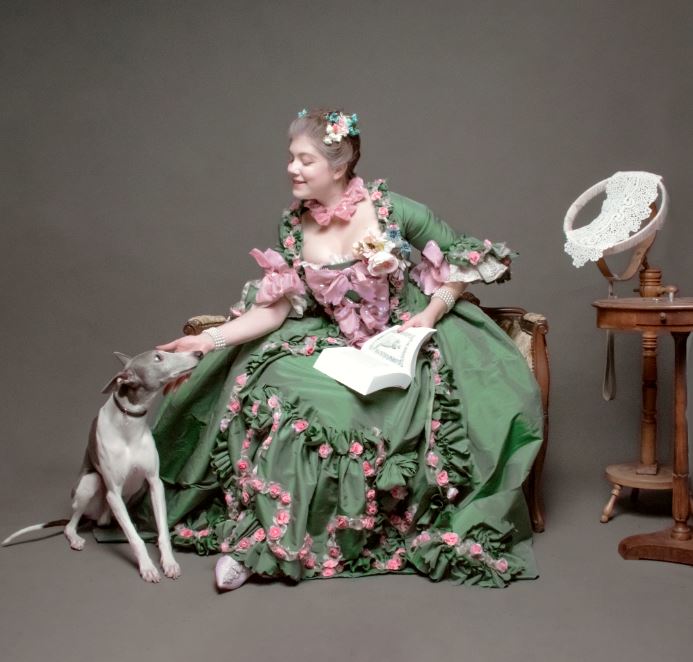
This blog post will cover why and how I did my recreation of the Madame De Pompadour dress with the roses, from the Boucher portrait, all the struggles and the compromises that brought to the final version.
I have just tested the dress at Carnevale, for the first time, and I finally decided it was time to start writing this blog post I too long postponed. Why did I procrastinated so much? Because it took a looong time to make this dress, to plan it and to come down to terms with some limitations. And showing doubts and highlighting compromise is not excactly something we’re taught to be good for businesses.
Why this dress?
It’s a very important dress for me, it’s been one of my first loves when I still didn’t know I would make costumes. Madame De Pompadour has also been one of my favorite historical figures. Why? Well, she was powerful. A strong woman that challenged the rules of her time (other kings had favorites and mistresses, but that was considered a privilege only nobles could access to, while she came from a more humble family of bankers), used the tools she had to reach power and to be free, and basically ruled France more than most queen did in those years. Her legacy, when it comes to arts, still reaches us.
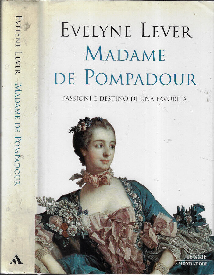
It all started when I was a child and I found this book in out basement. I asked my mom what it was a bout, and she told me a bit about her. I didn’t read it for years (and to be honest there are more enjoyable biographies of hers, this is quite boring when it comes to style), but in the end I brought it with me in my new homes.
I really suggest you to dive into the world of this most unique woman.
Fun fact and beginning of the troubles that got me to postpone this projects for something like five years since imagining actually doing it, and two since I started gathering materials: the painitng by Boucher in the cover has a completely different color in real life.
The Madame de Pompadour dress was also very important to me because of how famous this painting is, and how often we see the robe reproduced. In every recreation there was something I thought I could do differently: not necessarily better, but in a way I liked more. I don’t believe in just stating you can do something, I believe in doing and measuring yourself with the real thing. But for all these reasons I kept going back and forward on this project. Because of how dear the painting is to me, I wanted to be as precise as possible. And in the end I had to compromise. To every compromise I wanted to stop.
When I got the chance of a Versailles themed party in Venice, I thought that it would have been a nice deadline to finally give life to the project. This brought me to compromise because of time and budget limitations, yes, but it also brought me to actually finish something I had started gathering materials for about five years before.
The main thing to do, and the heaviest part on the budget was the fabric. If I had the budget and time to actually use metallic lace, as I planned, that would have probably been more expensive than 18 meters of silk…but having opted for something more friendly to my pockets (commissioning 25 meters of handmade metallic lace with the exact design was not among my possibilities).
Ok, silk taffeta. But what color?
This first question brought me to stop the project for almost two years. Seriously. Because every single picture you can see online has a different hue. Some are blue, some are teal, very few are green and none of them really have the color the real thing has in person. How fun. At this point I had seen the original painting only when I was so little I could not remember. I had been to the Alte Pinakothek in Munich, but I had no memory of the color at all. And in the museum postcards the shade is still different, I found out later. The Wikipedia image is somewhat close, but it’s too cold.
I spent two years gathering fabric samples.
You see, when you want something between green and blue you can get shot silk, or yarn dyed, or iridescent silk. What does it mean? That warp and weft have different colors, and according to how you move the fabric, different areas have different colors: in some areas you see more of the warp color, in some more of the weft, in some variable percentages of each. And I wanted a warm teal and white or light grey.
You can find green shot white, blue shot white, but finiding the exact color I wanted with white was impossible. And to have the fabric made…you need to commission something like 6 times the fabric I wanted. Out of question. Ugh. Also dyeing is not an option for these contrasting yarn silks: the darker bleeds on the lighter, so you end up with a flat color, instead of the iridescent and vibrant one you wanted. And then… getting 18 meters of fabric even would have been a nightmare.
So I convinced myself I needed to see the painting myself, so I would have chosen the color with full knowledge and without gambling on which image to pick as reference.
After covid restrictions lowered and allowed us to travel, I planned a trip to the museum. Luckly I live only 5 hours away. Getting in the museum was also an adventure, as their system wouldn’t read my husband’s vaccine certificate, as he had to take the third dose early, and the system was only working for the first and second. And then you needed a negative test done in the previous 12 hours. Luckly there were many test centers. After fearing to be sent back or to not be allowed in the museum, we finally got to the museum!
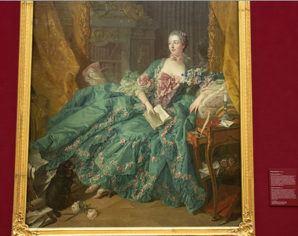
And we started the exibition from the wrong side. And there she was, in all her green glory!
I have to say that when looking at online images I liked the teal-ish better. However in person the colors are so much different and subtle!
The blood red wall on the back makes the greens pop, but don’t help much in photographing the thing. So I got photos with me in front of the painting, photos of me holding the samples in front of it (yes, guards looked at me in a weird way, in case you were wondering), and when I got home the first thing I did was to edit the raw image to mimic the colors of reality.
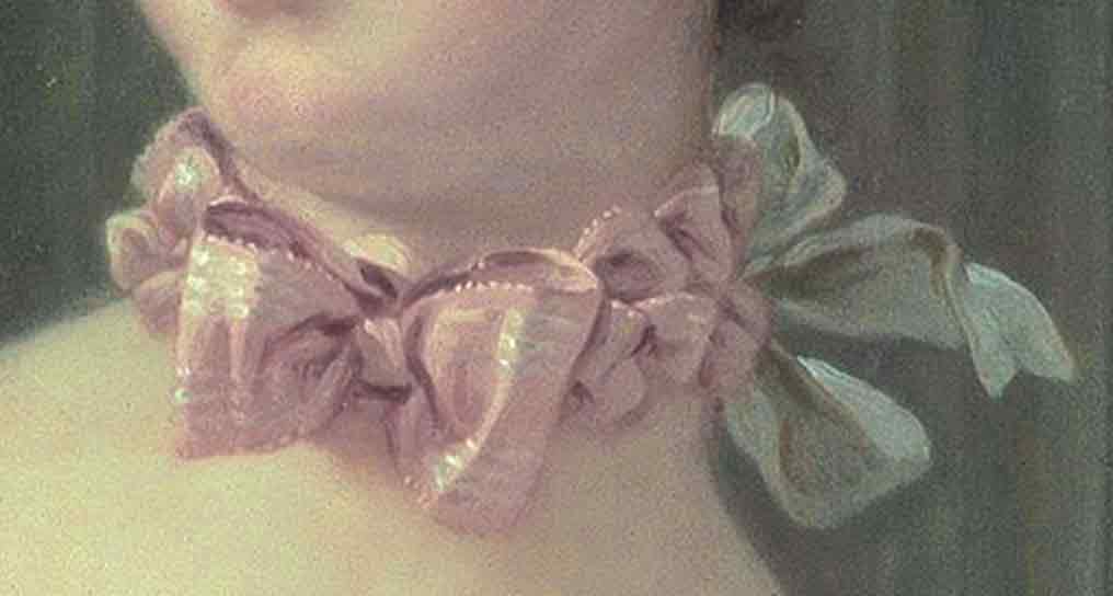
The images you see online are so saturated and vibrant, while the painting is a masterpiece of rococo taste and subtle variations. First of all the color of the silk is not super saturated, it’s the color that the canals in Venice have in certain days. There’s white and black in it, it’s not just blue and yellow. Then the ribbons and the roses: they have different shades of pink. The one of the ribbons is cold, greyish, ashy, while the roses are just a bit warmer, and match the accents on the face.
The painting is also very yellow. So what I did was to balance the whites of the lightest part of the image, to remove the right amount of yellow from it all.
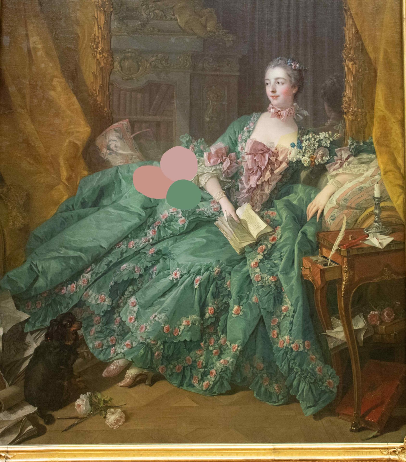
Only then I started sampling colors on photoshop to actually understand how much pigments and which ones to use for dyeing the ribbons and coloring the roses.
Here you can see half of the Madame de Pompadour dress in the original yellowish patina, and the editing and sampling on the other side.
I used the photos I took for the colors, however the wikipedia image had incredible detail, so I kept using both as reference.
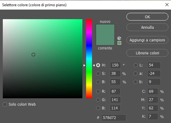
Here you can see the composition of the green. I sampled all greens and got the average of the medium ones.
So using an emerald green shot white makes lots of sense.
The fabric for the Madame de Pompadour dress was a nightmare to find. Not just for the samples, but for everything that happened since I ordered it.
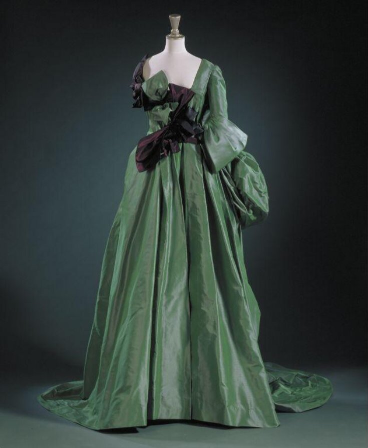
When asking to fabric dealers, I couldn’t give them the painting as reference, I needed something real. So the Watteau dress by Westwood (1996) was my reference.
Luckly, one of the samples I got matched the painting to perfection.
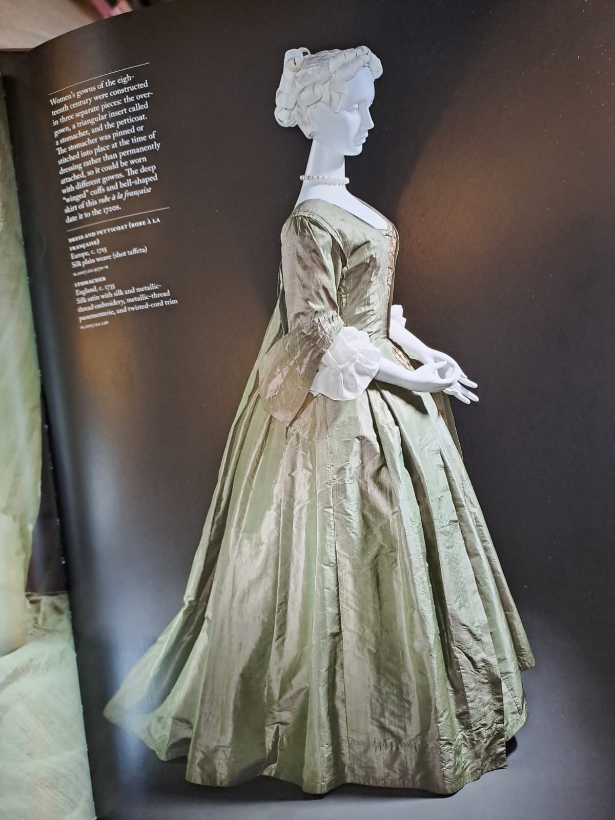
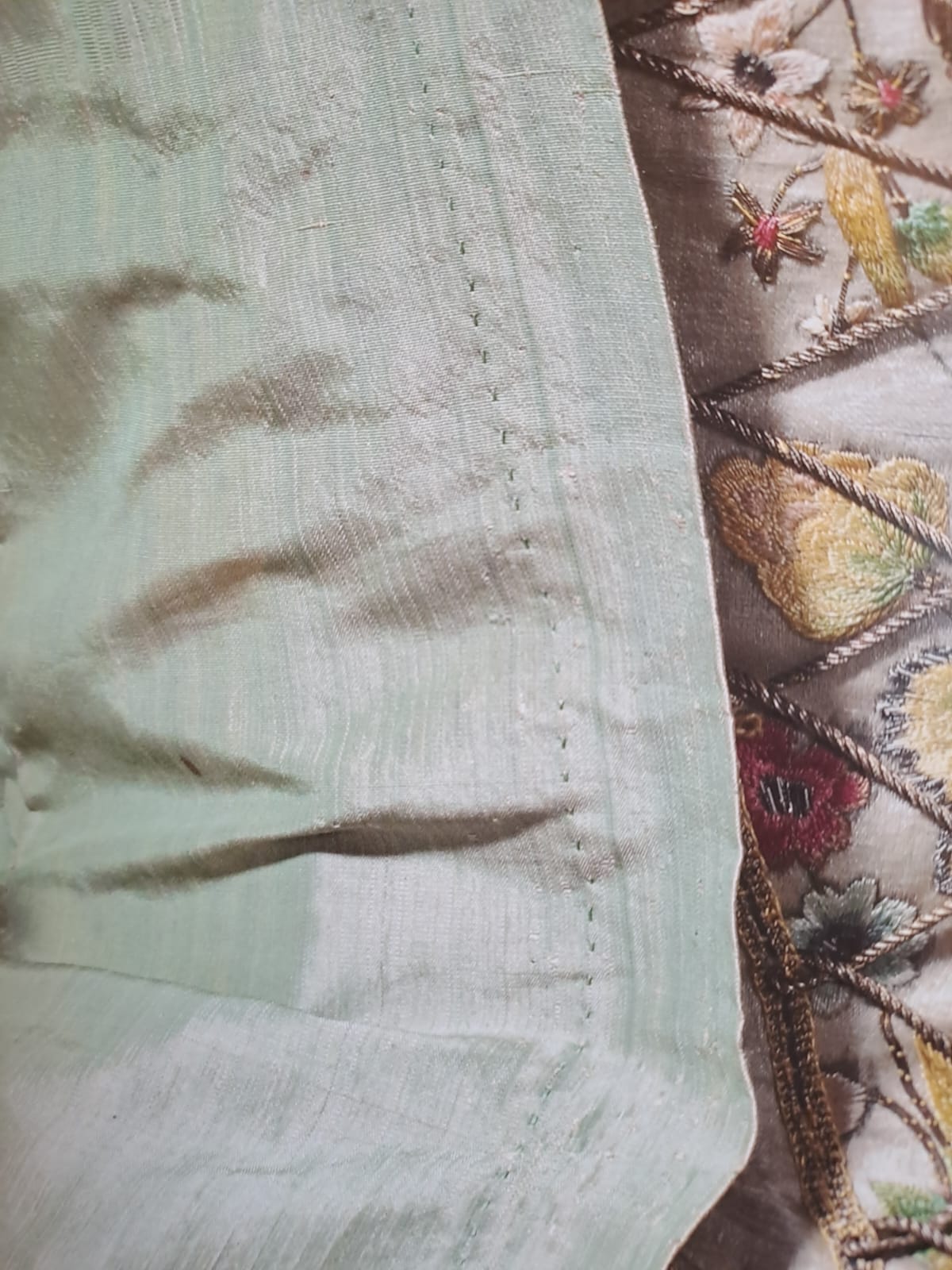
I have to say that there was no taffeta that matched, so I opted for a dupioni, because of the color. This is when I gave up and I decided to go for “look like the painting, give the same feel” instead of “choose accuracy over the looks”. However, not all silks from the time were perfectly even. Though this taffeta from the Fashioning Fashion book (Takeda Spilker, LACMA) has no slubs, it is not even, it almost looks like a tussar, rather than a taffeta. So an uneven look was fine. I was not a fun of the slubs, but they’re barely visible from afar. I also would have loved a more crisp hand, but again… if I wanted the right color I had only one fabric choice.
I ordered 18 meters of fabric from Puresilks. I am always reluctant to buy from them: pictures never match and they never ever do returns. But there was no alternative for the color, it was a match. So I paid. I paid shipping, I paid customs, I opened the package and… the fabric was nice. But didn’t look as I wanted it. Different bolts have differences, I know, but it was… it looked almost as…
It matched an other sample. My second choice, actually. Which was slightly more yellow and light. Not by much. I would not have noticed if I hadn’t kept those samples under my eyes for months.
Their reply when I wrote them? The fabric I chose was not available in the amount I wanted, so they gave me the other without even asking, because “it still a nice fabric, isn’t it?”.
In the end…
I had no refund, I could only get a discount on my next order. Or maybe I got a refund and the coupon was for an other order they messed up? Anyway, each time they promise they changed manager, that things will be different, but I am not basing this complaint over only one mistake, nor I am the only one complaining about this. They also keep changing name of the brand in order to get rid of the reviews, so be careful when purchasing indian silks. Some sellers are lovely and professionals, but some of them are hard to deal with.
I had 18 meters of silk. I didn’t want it to be wasted. And I had a date for the party, which I took as a sign that if I hadn’t made the dress for that event, I would probably have never finished it, blocked by perfectionism. The Madame de Pompadour dress had already waited for two years for the right fabric.
Lace is always a pain.
There’s a reason why some wedding gifts in wealthy families were lace parures. Lace requires so much time to make, that you’re basically wearing other people’s lives. You always are, but with lace especially so. And it is one of the reasons why to make a queen’s dress you need a queen’s budget. Some types of lace can not be made with machines, and making them requires time and skill.
So the Madame de Pompadour dress would have needed twice the budget, for a more accurate recreation, when it comes to lace. If we think of custom woven fabric, custom made lace, custom made flowers… my car would’nt even cover the cost of the supplies. So in the end I wanted a dress I could enjoy.
I actually purchased materials and tools to make my own bobbin lace. The first step was starting with cotton, and then trying to make nets out of metallic yarns. Real metal ones, not lurex. Doing things properly. And I would have needed months of practice before I could be precise. Years before I could be fast enough to make all the meters I needed.
At some point I calculated 25 meters. It would probably need less, but still. Even half of that was too much for my time, and too pricey to commission. There are still artisans making lace by hand. So if you can afford it, by all means support them!
So I actually worked with gathered metallic organza. I had it in black, I stripped the color to make it correct, and then used it.
Why metallics?
Well, I am not entirely sure the lace was metallic. It’s a bit too soft in the painting. The same goes for the stripes on the picot lace on the stomacher. But the lace is not white either. It would clash too much. Light green lace was not a thing, so I thought about what could have given it that color, and I though silver would reflect the green of the fabric. And having to wear the dress by night, a bit of elegant sparkle seemed a nice idea.
Here I had to resize my expectations as well.
At first I thought I was going to make the flowers by hand. Silk, starch, bronze flower making tools I got a few years ago with this purpose.
Then I counted how many roses I needed, and started making larger ones. Making small ones is harder. I would have needed 300.
Which roses?
Ok then, let’s buy the roses. But it’s not so easy. First they need to be very small.
When it gets to cosplay, you can know the height of the actor, calculate how big each element would be and get the exact size it needs to have on you. But when you’re dealing with a painting with weird proportions, a neck that is too long, a head that is much smaller, legs that are 1/3 longer…what to do? I tested.
There are two sizes of roses, one for the center opening from the waist up and one for all the rest. The ones closer to the stomacher are smaller. The others, however, need not to be larger than 3cm each.
Ancient ones!
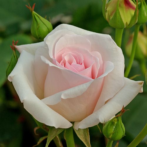
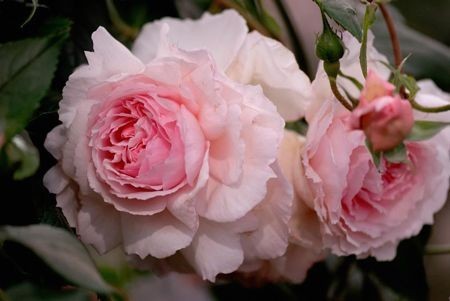
I was never happier to live in a country that has a long and kitsch catholic tradition, because small fabric roses are used for communion favors and such. So I started looking. It’s not easy to get the right roses, because domesticated flowers also have their history. Most of the roses we can find pre-made… are very modern, inspired by flowers that are not older than 150 years. Things that Madame De Pompadour could not have known: they did not exist!
The first image is of a modern rose, the second of an antique hybrid: they are so different!
So I started my hunt for pre-made roses that were smaller than 3cm and looked like antique flowers. I found them (long before the fabric!) and I started painting them. Then I got to see the painting and I had to re-paint them all because they were the wrong pink and too saturated.
The other thing I got way before the fabric was the ribbon, which for the Madame de Pompadour dress is probably as distinctive as the flowers, if not more. I wanted it to be picot, because the edge of the one in the painting was kind of wavy and textured, though the loops are not clearly visible.
That ribbon also has six stripes of grey-ish, that I chose to make in silver plate.
I found some nice vintage rayon picot ribbon and dyed it.Then I got to see the painting and I bleached and dyed it again. The next step was pinking the edges and glued each single strip of metal by hand.
The collar was the first thing I made with the ribbon, the fun thing is that the folds of the collar look almost like petals, like the decoration of the petticoat, the two diagonal festoons between the rows of flounces. I folded and sewn them onto a stripe of rolled white silk organza, to recreate the stiff and sheer white bow at the back of her neck.
Then there were the flowers, the ones on her head and the ones on the neckline. I played with some pre-made ones, taking the petals apart, painting them and recombining them. I created the buds with wax. I recreated each of the flowers, except the white ones with six petals, as the starting material didn’t get here on time.
I also made the shoes.
Why? Well, I wanted them to look like the painting. I want them not to have left and right, I wanted thin and soft soles, the heel with the shape of the painting. I wanted those shoes. And most of you already know how pissed I am that all modern historical shoes available to the public are too thick, too hard, with very modern shapes. Historical shoes were thinner and soft, like ballroom dance shoes. But the shape of the point is very different, so is that of the heel.
Louis heels that are available today have different shapes. In this case I wanted the heel to form the arch under the foot, all with round lines. I also wanted the point of the shoes to end like a cone, with the sole pointing up, instead of the upper bending down to meet a sole that lies on the floor.
I have very little experience in shoemaking. So I experimented, and then made my own pair. As exercise. I also know I want to remake them with real metal bobbin lace that I will make, when I will have more control and precision.
However the pair lasted for a whole night of dances, so I am very proud. I though they would have fallen apart after half an hour. I am improving!
I did the hairstyle using my own hair, which is very thin and little more than shoulder length. I made my own pomatum, using however shea butter and jasmine essential oil. It’s easier to prepare and to handle, and works like a charm on the hair, it’s like doing an oil mask, they’re so soft afterwards! I also use a mix of rice powder and talcum to powder. Nothing fancy.
Sewing the Madame de Pompadour dress
I went a bit creative with the reinforcement. I wanted it to have mode body than the fabric alone, but also to remain fluffy like in the painting. So I lined the skirt portion with silk organza and reinforced it with tarlatane. The base bodice is made of linen, different from that used for the lining of the sleeves.
I went for a 1740s-50s cut, with more folds on the front of the bodice than later styles. Everything was drafted over a pair of stays that I made to achieve the elongated shape of the torso.
And this is more or less how I recreated the Madame de Pompadour dress!
But now enough with the boring detail of all the hand sewing (except the foundation bodice and petticoat everything has been hand sewn), let’s go to something fun!
I tried to replicate the non-realistic proportions of the painting by altering a photo I quickly took at home as test!
While I wait for better images, I hope you’ll find it as funny as I did!
