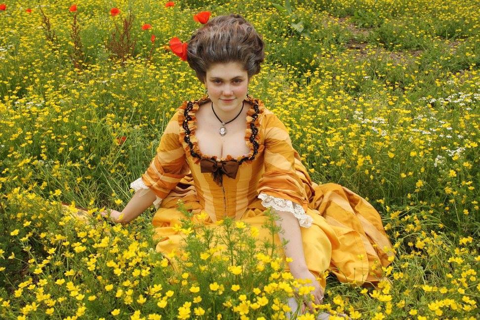
Some time ago I shared an Instagram story asking my followers to send me a picture of them, so I could tell them which colors would suit them, according to my taste.
I come from a place of goth, and getting used to colors took me very long. So I wanted to help others.
As a freelance costume designer, I often see people blocked on some shades. “I don’t look well in pink”. “Yellow doesn’t suit my eye color” or “teal really is my color” and such. Most of them surprised me, and some other times I was quite puzzled on why the customer chose a color that really didn’t work nicely with them.
At the same time there are many schools of thought about how you should choose your colors. Some of them have some helpful stuff, but most of them are too strict.
I will give some average guidelines, show you how I think, and then you’ll be able to choose. There are exceptions most of the time, but before handling why some specific shades of teal work well on almost everyone, you need to master the basics.
I wear all colors, even those which shouldn’t suit me. Because I choose colors to create emotions in who sees. So an unsettling combination can be used to create a specific character. Yellow doesn’t look good on me. But I don’t care. I don’t wear it all the time, but I know how to wear it and to create what. To stand out in a crowd, to look intimidating, it works. Navy looks good on me, but also plain and safe. You can wear every color you want, as long as you choose it knowing your goal. And never trust when someone tells you that red isn’t your color: somewhere there’s a red shade you can absolutely rock!


You will need to know a little basics of color theory.
Don’t be frightened: it’s something you already use, even if you don’t know it yet.
White is pure light with all colors in it, black is absence of light. Color is light. Color is a specific frequence of light, if you want to dig into the physics. However here we will discuss color in objects and not the color of light. Which is why we will consider as primary colors primary yellow, magenta red and cyan blue, and not green instead of yellow.
Yellow, red and blue. You need to consider the pure, primary ones. As for example using a scarlet with blue will get you a brown, because scarlet is an impure red, it has yellow in it!
All colors can be generated from these three primary ones, plus black and white, which are non-colors.
Colors containing two of the primary ones are called secondary colors. 50% of blue plus 50% of yellow give a green, and so on. But there’s such a wide range! If you add just a hint of yellow you can get teal. If you add just a hint of blue you get lemon yellow. If you add a hint of yellow to magenta you get a proper red, if you add 50% you get a dark orange.
If we consider the color wheel, with primary and secondary colors, we can start talking about complementary colors. I could say that the complementary one is the color on the other side of the color wheel. But it’s been easier to teach it by saying that one color and it complementary have all three primary ones in them. So if I take cyan, which ones are left? Red and yellow. Mixing them you get that dark orange, so it’s the opposite, the complementary. If I take green, made by yellow and blue, what’s left out? Red! If I take purple, made by red and blue? Yellow.
If you want to be precise, if you consider a color and its complementary, you need to have 100% of all the primary ones, when forming the couple.
But let’s get things easier. Let’s say you pour on a palette the same amount of cyan, magenta and yellow. Let’s then say you take 60% of that cyan and 100% of the magenta and you mix them to create a beautiful purple. Its complementary will not be any yellow. It will be the light green created by the 100% of yellow and the leftover blue.
So we have to point out that a sunflower yellow is, in fact, an orange, made by just a little red. Or that scarlet is a very red orange.
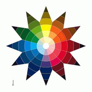
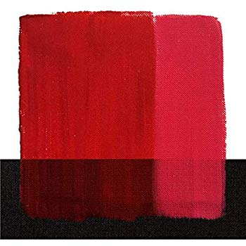
Then we can take a third color. To make a specific type of red, we might use magenta, a little yellow and also a little blue. That’s a tertiary color. They’re usually less bright. Some call tertiary colors the colors made by tree parts of one primary, and one part of the other. But it’s not very helpful. They’re still made by two primary ones.
Once we master these, we can think that to every step, every color among these, we can add white, or black. Or even both! Adding both makes colors less bright. Which means that if you use a bright orange and you place it next to a lilac created by purple and white and black, you get the effect of an incandescent sunset.
Now let’s consider that you have cold and warm colors.
Ideally, from the middle green to the middle purple you should be able to split the wheel in two. I like better to say that from pure yellow to just before the magenta you get warm tones. All the others are cold.
Why is so much cold? Because we’re talking about skintones. And all of our skintones are warm. So in relation to something that already is warm, most is cold. It’s relative. If you get a yellowish green and a deep emerald green the lemon green will look warmer.
But let’s get to the core of the matter: what colour is our skin? White! Pink! Black! Yellow! Red!
None of these. No matter if you’re balck or white, our skin color is a mix. We have thousands of different shades in our face, so we consider the average tone we use as foundation, in makeup.
All of our skintones are made mixng a lot of yellow, with less red and even less blue. Then you can add white or black, or none. Each one of us has a specific combination of these, but even the whitest of skins isn’t just white and red pink, it has all the others, as the darkest of the ebony skins isn’t black.
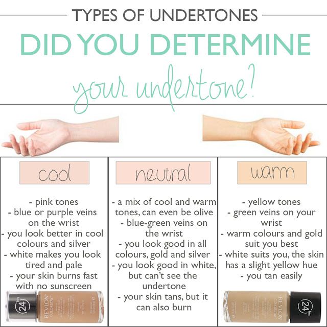
What we’re going to take into consideration is how warm your skintone is. When purchasing a foundation, you usually have the neutral tone, then the warm (more yellow) and the cold one (not more blue, just less yellow).
We can stay here and discuss eyes or hair color, but the point is that the thing we see next to the edge of our clothing is our skin. Our hair, rarely. Our eyes? Meh. If you really want them to pop, you can dress for your eyes, but that’s not something I do. That’s what the eyeshadow should take care of.
I’m on the cold side. When on the sun I don’t tan, I get burns. I’m the one people always ask if I’m sick. Or they tell me to tan. It’s more usual on lighter skin, but there are people with darker skintone and cold undertones. They can play a bit more than I do, to say the truth.
The rule is quite simple: keep it cold.
Magenta looks nice on me. So do all the blues. Cold reds, all purples, the cold side of greens
You can kill me with a peachy pink. I would pick it to look like a zombie. Peachy pink is the worst, as it’s close to what I should look, and makes me look “wrong”.
I can rock blues, deep and cold reds (on the side you can see a warm red, which I chose as it makes me look paler, making the redness of my skin look less red and therefore less perceived by the eye- once again, you can do everything if you know what you’re doing) to purples, emerald greens. Teal is for everyone.
And I look good in greys and all the colors with grey in them, except once again yellows and oranges and everything in that range.
But some orange-ish blush can make me look very healthy (thing that I don’t like much) or some orange-ish brown eyeshadow can make my grey eyes look more blue. Because when you have a neutral color, and you place it close to an other one, it looks like the complementary of the bright one.
As you can see, you can do everything, as long as you know.


If you’re on the neutral side, lucky you! It’s my husband’s skintone. When in the sun, his skin becomes gold. He always looks so healthy.
You can wear almost everything. Especially if you’re more on the caramel than on the white.
Orange is not yet for you. Whites are great. Grey not so much. Black not really.
Purple is ok, unless it’s pastel. Greens are amazing, just not the emerald ones. Teal is great.
Basically, stay on the warm tones if you want to look less yellow, play on the cold ones if you want to show how gloriously golden your skin is.
Then, let’s talk about what I call the warm side. Which is what we call “olive”.
You can rock the yellow and the orange. You basiclaly can wear with success the warm tones and some of the boldest choices in the palette. Just be bold. You can hardly go wrong. Think of the beauty of indian women in their traditional clothing, or the bright and saturated colors of folk costumes in southern counties of the world. You can.
Your Achille’s heel is grey. And all the ashy tones. Remember that grey-ish lilac I mentioned, the sunset one? Those things can bring you down. The less white and black in a color, the better for you!
White never looked better, black works for everyone.
A side note to this skin type: your color changes according to how much sun you get. And that means you should listen to your body. If you have olive skin and have been avoiding the sun for a long time, you may want to be careful, as in that specific case it’s easy to make you look sick. And you don’t have the porcelain look of the first type, so you don’t look sick in the romantic way (the consumption look so fashionable in the 1850s), you look like a corpse with a light grey. Which can be, of course, used at your advantage. Want to stay home because you’re sick? Get that grey melange hoodie out of the closet.

This is the basic.
If you’re rehabilitating from an era of all black, like I did, start with the darkest tones and the greys, if you can.
After years making costumes, I really think everything is for everyone. Except greyish colors, orange, yellow and peach pink.
But even an olive-skinned woman could rock a nightgown in silver silk satin. Would she probably look better in a red one or in a green one? Yes. But that doesn’t mean you have the comparison on the side.
You can use what’s good for you and what isn’t, to create emotions in your public. You want your boss to listen and look at you while asking for a promotion? Wear something that makes you pop and look great. Want to let your students know you’re having a bad day and they have to behave, if they don’t want to face the consequances? Wear something in high contrast with your skintone. Want to stand out from the crowd? Go where the others don’t dare, but do so by chosing a shade that suits you, a bit colder or warmer than the basic.
This has been used in movies forever! Why do some costumes remain in our mind? Because they empower the script, the scene, the feelings. Choosing colors is choosing emotions.
Now, for example, it’s fashionable to have movies and such edited to have combinations of teal and golden oranges, or emeralds and yellows. Then there’s Joker, trying to make you feel uncomfortable by using blue and orange.
It’s also used in photography. Using complementary colors or adjacent ones with knowledge creates wonders!
Being a costume designer is like being a painter. What should the lady in the painting wear? Which color would look great on her, to channel the emotion I want from the final image? Ask that when looking in the mirror.


